Technology
Services
Resources
Digital marketing activities don’t just play out on one channel. From advertising publishers and social management tools to mobile analytics portals and call tracking solutions, the modern marketing organization is tasked with juggling a matrix of disparate systems to map and refine their customers’ increasingly complex paths to purchase. With the number of marketing avenues open to businesses continuing to grow exponentially, the predominant challenge facing marketers is managing the sheer volume of data they are collecting via these siloed platforms. The success of any marketing strategy today has thereby become hinged on being able to effectively track and report on all this data to uncover how every channel is working in harmony to drive revenue.
That is where marketing dashboards come in, replete with all the mechanisms needed to empower marketing teams to turn a pile of fragmented statistics into dynamic visualizations that offer an interconnected overview of how marketing investments pay off. Dashboards have the power to tell countless different stories, and consequently how they are modeled and displayed will depend entirely on the role of the user. Digital analysts and those more closely involved with the day-to-day management of data should place a focus on visual aids that drill down into recent performance over short time periods. A marketing executive, by contrast, will be primarily concerned with big picture trends and analyses, as opposed to the intricacies of how campaign X performed on channel Y. “How much have we been investing? Where have we been investing? How does that compare to our budget planning?” These are the questions a Chief Marketing Officer will want answered in a dashboard.
This blog post highlights five dashboard components essential specifically to marketing leaders. Collectively, the snapshots depicted here provide the high-level data a decision-maker needs to measure campaign efficacy quickly and ultimately determine strategic objectives moving forward.

Overview:
Dashboards need to tell a story. This component does that both immediately and effectively. By headlining the dashboard with this succinct executive summary against high-level goals, CMOs can identify within the first 10 seconds of viewing whether something is amiss. These metrics quantify the overall impact that an organization’s marketing approach is having on their market and illustrate if there is a need to scrutinize particular areas of their program more acutely. These numbers inherently only demonstrate value if the data is recognizable to the user and they know what to expect. “By now, I anticipated having spent 2.48 million and therefore this makes sense. However, I was forecasting a ROAS of 650% and we’re noticeably short of that. Why?” Quick, penetrating insights are what this visual aid is designed to induce.
Overview:
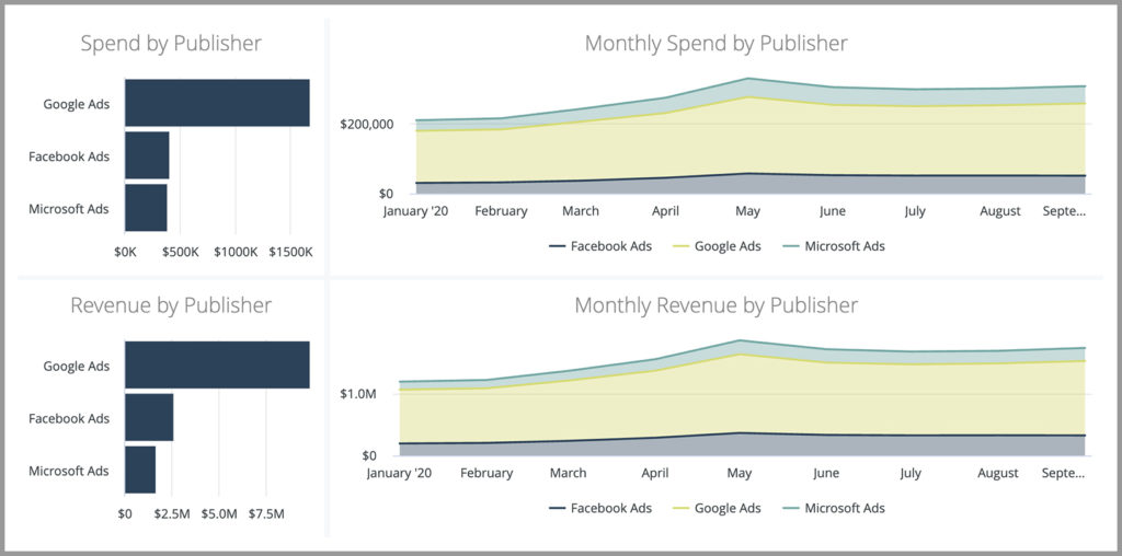
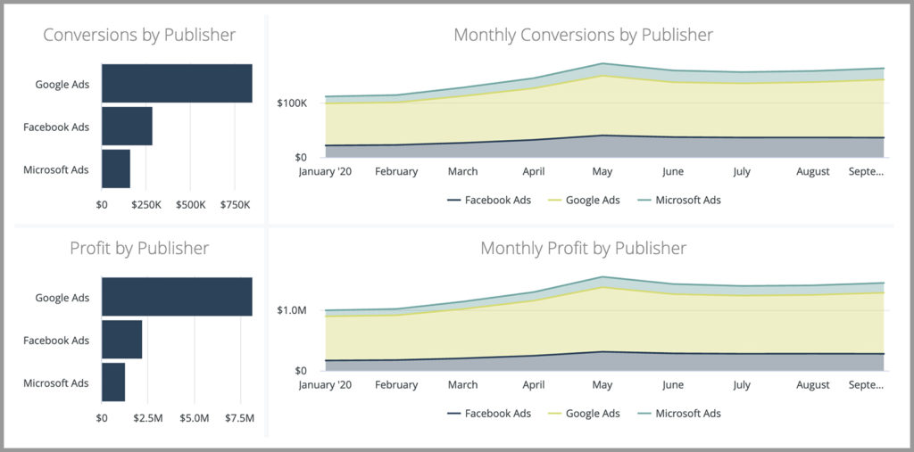
Pictures equal a thousand words, and that should certainly be true for CMO dashboards. While the headlining component above details the hard-core marketing metrics in aggregate, these eight simple visualizations handily break down those numbers to showcase how each channel is performing independently. For businesses and CMOs to continually outpace their competition, marketing teams need to be driving replicable growth month-in and month-out. Boosting revenues and profits relies on a constant process of identifying areas for optimization across marketing channels and swiftly responding to market movements. This component empowers marketing executives with the information they need to do just that.
Looking at the charts, one can observe that spending is at similar levels on both Facebook and Microsoft ads, yet revenue and conversions are both higher on the social channel. Seeing this, a CMO can then instruct their team to assign more budget to Facebook and monitor how the change in approach works out. That’s ultimately the nature of the information an executive can extract here: big picture trends for the year to date. Utilizing stacked charts - with the total value at the top and the breakdown in between - is particularly valuable in this context as they fluently expose swings and smooth progression from one month to the next as opposed to displaying each channel’s performance individually as distinct entities.
Overview:
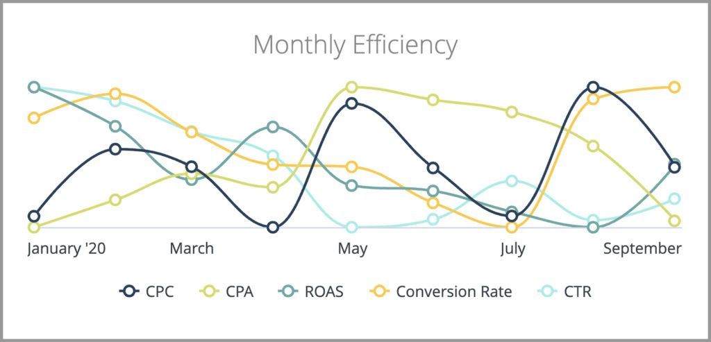
Data by itself can be incredibly dry, and it is the job of a dashboard to bring numbers to life. This dynamic line graph unpinned from zero is a great example of that. It’s a visual aid built without a y-axis to highlight that the most important piece of insight here is the correlation between efficiency metrics rather than the actual value themselves. This chart is not modeled to reveal whether you’re hitting your CPA goal, for example - that data is in the headline component - but instead what the overall trends are in terms of relationship to one another over the course of the year.
Driving efficiency is shaping up to become the top priority for CMOs over the next few years. In a recent study titled The Modern CMO conducted by Forbes Insights, it was found that 46% of CMOs named efficiency as being top of mind. The study - which surveyed more than 200 CMOs in global companies - revealed that efficiency was more significant than other areas of marketing including customer experience, brand awareness, investing in technology, reaching younger generations, and global expansion. With CEOs progressively looking to marketing chiefs to connect investment to revenue and enterprise value, showcasing consistent improvement across these efficiency metrics is going to become table stakes for marketing teams. It is vital, therefore, that CMOs have a pulse on how they are swinging and shifting.
Overview:
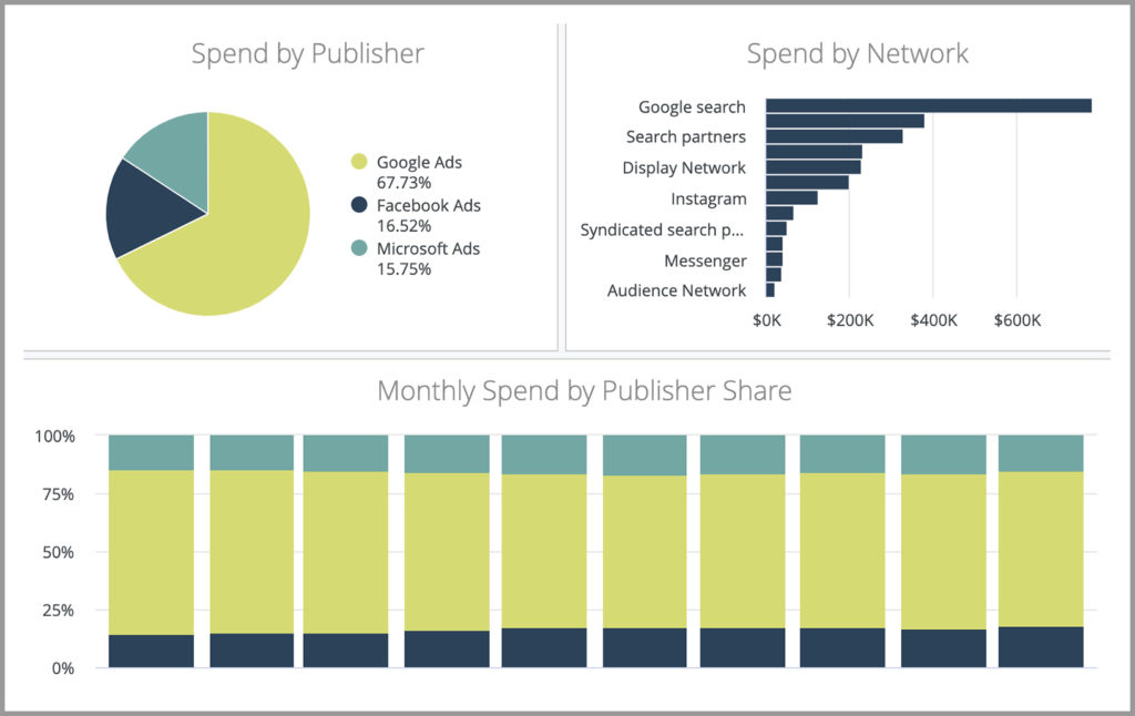
CMOs are directly accountable for marketing performance and so they must be able to demonstrate clearly where budgets are being spent. With marketing campaigns today more multifaceted than ever before, these pie charts and stacked bar charts provide a birds-eye view of how a strategy is evolving and how an investment portfolio breaks down. If one publisher begins trending against expectations, or if certain investment criteria are not being met, these visualizations will expose that and afford marketing teams the opportunity to rectify the problems before they escalate.
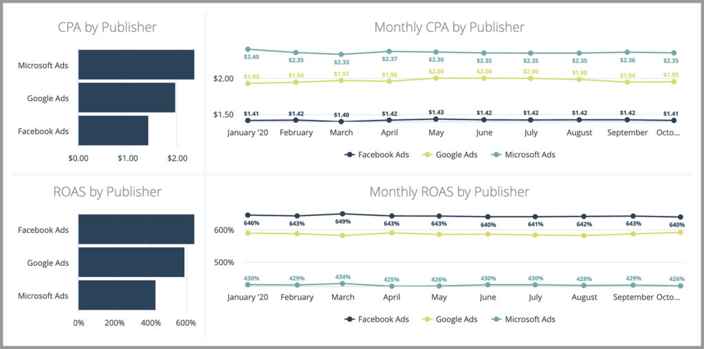
Overview:
The goals of digital marketing teams vary significantly from company to company, but what unites them all is a desire to make the most of every single dollar they invest. To understand how strategies are unfolding, CMOs are principally looking at their Cost per Acquisition and Return on Ad Spend; two metrics that are critical in determining campaign health and authority. These two line graphs together offer a baseline of how CPA and ROAS measure up on each channel and essentially communicate what’s working and what isn’t in terms of advertising spend. Marketing leaders armed with this information are then empowered to design a more robust investment blueprint that doubles down on the most lucrative advertising outlets and iterates on the others accordingly to drive improved outcomes.
The most effective CMO dashboards simultaneously answer executive-level questions about performance, tell a logical story, convey a hierarchy of priority, simplify comparisons, and avoid reporting overload. Their fundamental objective is to provide a CMO with the data required to make smart decisions, course correct, and improve planning and forecasting for the months and quarters ahead.